As was illustrated with our Dive Into Dijit with AMD post, the Dijit library provides an extremely powerful, flexible set of Dojo-based widgets with which you may easily enhance the look and functionality of your web application. These widgets include drop down / popup menus, dialogs, page layouts, trees, progress bars, and form elements. When looking at these elements, it’s easy to see that Dijit enhances their presentation, but this post will focus on enhancing functionality; specifically, enhancing a basic form with usability improvements and validation.
Quick Dijit Implementation Review
The first step in introducing Dijit to any page is including Dojo:
<script src="http://ajax.googleapis.com/ajax/libs/dojo/1.8/dojo/dojo.js"
	dojoConfig="isDebug:false,async:true"></script>
The next step is requesting the Dijit theme stylesheet:
<style type="text/css">
	@import "http://ajax.googleapis.com/ajax/libs/dojo/1.8/dojo/resources/dojo.css";
	@import "http://ajax.googleapis.com/ajax/libs/dojo/1.8/dijit/themes/claro/claro.css";
	@import "http://ajax.googleapis.com/ajax/libs/dojo/1.8/dojox/form/resources/CheckedMultiSelect.css";
</style>
The last step is adding the theme name as a class for the body element:
<body class="claro">
Enhancing Basic Form Elements
Note: this tutorial will use the declarative method of widget creation. You may create any Dijit widget programatically using dojo/behavior as described in Dive Into Dijit with AMD.
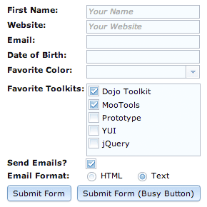
The first step in enhancing our static form is enhancing the form elements themselves. Dijit provides a corresponding widget (sometimes two or three) for the different types of form elements. Using the declarative method of Dijit widget creation and the data-dojo-type attribute, we’ll quickly widget-ize every piece of our static form:
<form action="process.php" method="get">
<!-- text inputs: dijit/form/TextBox -->
<strong>First Name: </strong>
<input type="text" name="firstName" placeholder="Your Name" id="firstName"
data-dojo-type="dijit/form/TextBox" />
<strong>Website: </strong>
<input type="text" name="website" placeholder="Your Website" id="website"
data-dojo-type="dijit/form/TextBox" />
<!-- radio buttons: dijit/form/FilteringSelect -->
<strong>Favorite Color: </strong>
<select name="color" id="color" data-dojo-type="dijit/form/FilteringSelect">
<option value="">Select a Color</option>
<option value="Red">Red</option>
<option value="Green">Green</option>
<option value="Blue">Blue</option>
</select>
<!-- radio buttons: dijit/form/CheckBox -->
<strong>Send Emails? </strong>
<input type="checkbox" id="checkbox" checked="checked"
data-dojo-type="dijit/form/CheckBox" />
<!-- radio buttons: dijit/form/RadioButton -->
<strong>Email Format: </strong>
<input type="radio" id="radio1" name="format" checked="checked"
data-dojo-type="dijit/form/RadioButton" />
<label for="radio1">HTML</label>
<input type="radio" id="radio2" name="format"
data-dojo-type="dijit/form/RadioButton" />
<label for="radio2">Text</label>
<!-- submit button: dijit/form/Button -->
<input type="submit" value="Submit Form" label="Submit Form" id="submitButton"
data-dojo-type="dijit/form/Button" />
</form>
Our static, previously boring form elements have been themed and extended with extra functionality. A few notes with regard to widgets we created above:
- The
FilteringSelectwidget duplicates the functionality of a nativeselectelement by:- Setting an initial value based on one of its options having a selected attribute.
- Enforcing a fixed set of possible results based upon the values and text of each
optionelement. - Providing keyboard accessibility
-
The
FilteringSelectwidget adds the following functionality to the basicselectelement:- You may type values into the
FilteringSelect; autocomplete is employed. - If an invalid value is provided, an error message is provided to the user.
- You get more control over the display when the widget is disabled.
- You may type values into the
- The HTML5
placeholderattribute within theinputelements are parsed by Dijit to provide this functionality cross-browser.
Now that the basic form has been widget-ized and themed, we can add basic validation functionality.
Form Validation with Dojo
As with just about every client-side problem, Dojo’s got a great solution for form validation. Luckily there are only a few key components required for basic form validation.
dijit/form/ValidationTextBox
A precursor to the overall validation of a form is deciding which elements are required. Say we want to require the first field; the data-dojo-type of that will will change from dijit/form/TextBox to dijit/form/ValidationTextBox:
<input data-dojo-type="dijit/form/ValidationTextBox" required="true"
	type="text" name="firstName" id="firstName" placeholder="Your Name"
	data-dojo-props='missingMessage:"Ooops! You forgot your first name!"' />
Since required="true" has been added to the widget, an error icon and tooltip (with error message) will display if the user fails to place text into the box. A custom error message can be placed within the missingMessage attribute, otherwise a generic message will display.
What if the field requires special validation of the pattern of input? That’s where the HTML5 pattern attribute comes in:
<input data-dojo-type="dijit/form/ValidationTextBox" required="true"
	pattern="(https?|ftp)://[A-Za-z0-9-_]+\.[A-Za-z0-9-_%&\?\/\.=]+"
	name="website" placeholder="Your Website" id="website" type="text" />
Not only is the website field now required but the value of the field must pass the regular expression test provided by the pattern attribute.
Validation Utilities with dojox/validate
The dojox/validate library includes numerous utility functions and regular expressions for validating form element values. These utility functions can validate email addresses, URLs, phone numbers, zip codes, and much more. An example usage of dojox/validate with a ValidationTextBox would look like:
<script type="text/javascript">
	require(["dojox/validate", "dojox/validate/web"]);
</script>

<strong>Email:</strong>
<input type="text" required="true" name="email" id="email"
	data-dojo-type="dijit/form/ValidationTextBox"
	data-dojo-props='validator:dojox.validate.isEmailAddress' />
The validator attribute is a link to the validation function for emails. dojox/validate is especially helpful if you don’t feel comfortable with regular expressions. There are also locale-specific packages within dojox/validate. The API docs provide a complete listing of dojox/validate helpers.
Attributes
You may by now have noticed that some attributes are used directly on the element and some are used within data-dojo-props. The rule is quite simple: if it is a valid HTML5 attribute, it can be used directly on the element. If it is a proprietary Dijit attribute, it should be placed within data-dojo-props. I say should, because proprietary Dijit attributes can still be placed directly on an element, but the page will not pass an HTML5 validator.
Speaking of validators, there was a special case with:
data-dojo-props='validator:dojox.validate.isEmailAddress'
Some functionality in DojoX is not completely AMD compliant in the way its module identifiers are provided via markup, such as accessing the isEmailAddress function in dojox/validate within markup. Programmatically it works fine with AMD, but in markup there is currently not a way to access it as a non-global, which also explains the dot syntax, and the fact that dojox.validate.isEmailAddress is not treated as a string.
dijit/form/Form with the onSubmit Event
Now that our required fields are in place, we’ll enhance the wrapping form element with data-dojo-type="dijit/form/Form":
<form data-dojo-type="dijit/form/Form" action="process.php" method="get">
<script type="dojo/method" event="onSubmit">
<!--
if (this.validate()) {
	alert('Form is valid, submitting!');
} else {
	alert('Form contains invalid.  Please complete all required fields.');
	return false;
}
return true;
-->
</script>
<!-- form fields here -->
</form>
Accompanying the dijit/form/Form is a special script element. Within this Dojo-specific script is a this.validate() test, acting on the dijit/form/Form instance, which validates the entire form based on require="true" inputs. You could also add your own custom validation within the code block as well.
The dijit.form Collection
I’ve only touched the most-used Dijit widgets within my example above. There are several more outstanding form widgets within Dijit; let’s take a look at a few other helpful widgets!
DateTextBox

Asking the user to format a date properly can be a nightmare, especially if other form fields within the page rely on the contents of a given date field. Dijit provides a dijit/form/DateTextBox class which displays a user-friendly calendar widget for users to select a date on.
<!-- when the user focuses on this element, the calendar appears -->
<input data-dojo-type="dijit/form/DateTextBox" required="true"
	data-dojo-props='missingMessage:"Please provide a valid date."' type="text"
	name="date" id="date" />
CurrencyTextBox
The dijit/form/CurrencyTextBox class helps the user to properly format and validate currency per a given locale.
<!-- {fractional:true} means you must provide cents -->
<input data-dojo-type="dijit/form/CurrencyTextBox" required="true"
	type="text" constraints="{fractional:true}" currency="USD"
	data-dojo-props='missingMessage:"Please provide both dollars and cents."'
	name="weekly_wages" id="weekly_wages" value="2000" />
Textarea
The dojox/form/Textarea class enhances a given textarea element so that the element grows in height as the user types.
<textarea data-dojo-type="dijit/form/Textarea" name="comments"></textarea>
Enhancing Basic Dijit Widgets with DojoX Alternatives

As nice as many of the Dijit widgets are, DojoX hosts numerous enhanced widgets that solve problems that many basic widgets cannot. The following are a few notable DojoX form widgets.
BusyButton
dijit/form/Button works great but what if I want to disable the button (to avoid double submissions) and provide a feedback message (i.e. “Sending form….”) when clicked? We could use dojox.form.BusyButton to do just that:
<!-- assuming dojox/form/BusyButton has been required... -->
<input id="busyButton" data-dojo-type="dojox/form/BusyButton"
	   label="Click Here (Busy Button)"
	   data-dojo-props='busyLabel:"Busy for 1000 ms...", timeout:1000' />
CheckedMultiSelect

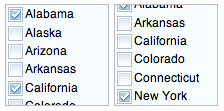
What if our select element allows for multiple selections? That’s the perfect opportunity to use the dojox/form/CheckedMultiSelect widget:
<!-- assuming dojox/form/CheckedMultiSelect has been required... -->
<select multiple="true" name="rockers"
	data-dojo-type="dojox/form/CheckedMultiSelect">
	<option value="Oasis">Oasis</option>
	<option value="Rod Stewart" selected="selected">Rod Stewart</option>
	<option value="Coldplay" selected="selected">Coldplay</option>
	<option value="Kings of Leon">Kings of Leon</option>
</select>
PasswordValidator

What if our website features a form that allows updating/changing of passwords? The dojox/form/PasswordValidator provides all the functionality you need to quickly implement that system:
<!-- assuming dojox/form/PasswordValidator has been required... -->
<!-- pwValidate is the name of your function that verifies the current password is correct -->
<div data-dojo-type="dojox/form/PasswordValidator" name="pwValidate">
	<!-- pwType=old is where the user must place their current password -->
	<input type="password" pwType="old" />
	<!-- pwType=new is where the proposed new password must be placed -->
	<input type="password" pwType="new" />
	<!-- pwType=verify is where the user verifies their new pass -->
	<input type="password" pwType="verify" />
</div>
Reminder: JavaScript validation is not a substitute for server-side validation; JavaScript simply enhances the user experience by providing instant feedback to the user.
Note: If you need to pass HTML5 validation, you probably can’t use PasswordValidator declaratively.
The dojox/form Collection
The dojox/form namespace hosts a huge assortment of widget enhancements, including:
- TimeSpinner – same as a normal
NumberSpinner, but for the time component of a date object - MultiComboBox – accepts multiple inputs on a single line
- DropDownStack – disable/enable form elements based upon a selection
- RangeSlider – allows values to be chosen via a sliding scale
- Rating – easily creates UI for ratings (star ratings)
- Uploader – streamlines the file upload process
- …and much more!™
Great Dijit & Dojox Resources
- Dijit Theme Tester
- Dive Into Dijit with AMD
- DojoX Form Reference Guide
- Dijit Form Reference Guide
- Dojox Validate Reference
The Dijit and DojoX Form libraries are much more than just gloss on your elements — they are a hugely functional set of classes to make life easier for both you, the developer, and your users.
